
Color Management
Color management is the behind the scenes system that makes sure your colors look the same everywhere, from your screen to the finished print.
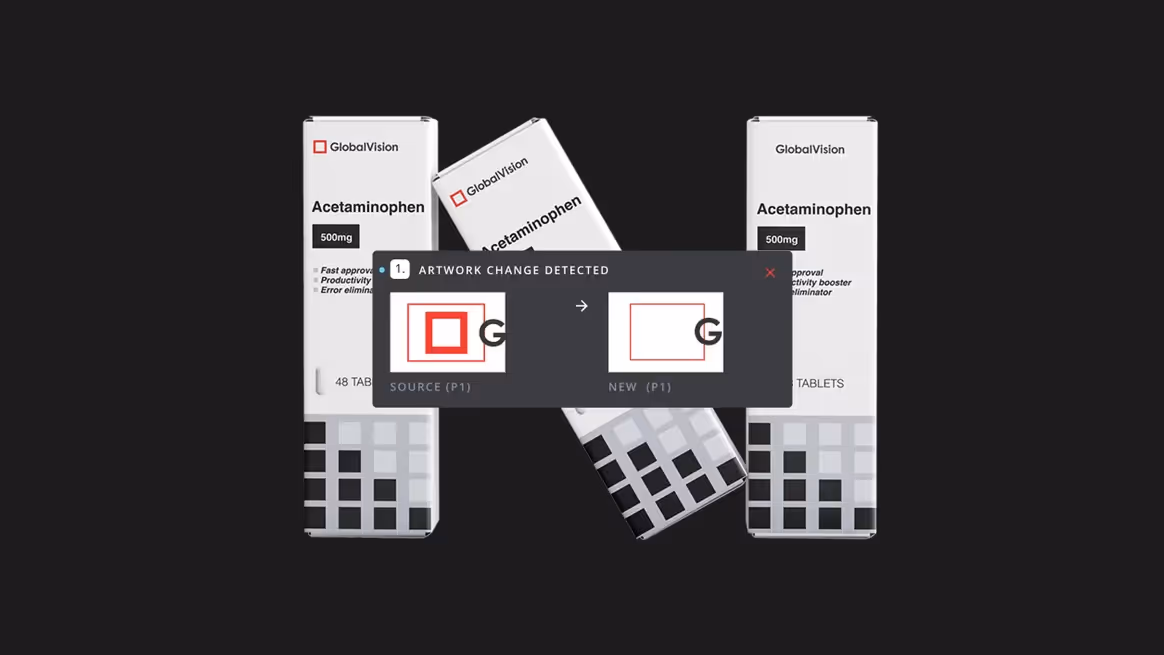
It’s how designers, printers, and brands make sure that reds, blues, and yellows match exactly, every time. Without it, colors can shift, logos look off, and packaging loses its impact.
Why Color Management Matters:
- Consistent Colors: Your brand red is the same on a monitor, a label, or a carton.
- Brand Integrity: Accurate colors keep logos, designs, and packaging recognizable and trustworthy.
- Saves Time & Money: Reduces costly reprints caused by unexpected color shifts.
- Professional Results: Every print run looks as polished and precise as the first.
Use Cases in Print & Pack:
- Packaging and label production with strict brand color requirements.
- Proofing marketing materials before mass printing.
- Ensuring consistent colors across multiple SKUs or production sites.
- High-quality promotional materials where color precision is critical.
Color management is the hidden key behind every perfect, consistent, and professional-looking package, turning designs into colors that customers recognize and trust.
See Other Guides

The Ultimate Guide to Prepress Quality Control: From Preflight to Perfect Prints
Excellent quality control before printing turns a good business into a great one. Catching mistakes early and keeping your standards high makes every project run smoothly. Clients will be impressed by your reliable and detailed work.

Production Quality Control: A Step-By-Step Implementation Guide
When a packaging company ships labels with incorrect barcodes or a printer delivers cartons with color variations that don’t match brand standards, the fallout goes far beyond immediate reprints.
The Only Artwork Label Proofreading Guide You Need
Streamline Artwork Proofing From Prepress to Production
Elevate labeling and packaging accuracy with the market-leading artwork inspection software.
